A short explanation of some undocumented formatting options for qicharts2.
Author
Calum Polwart
Published
October 11, 2024
Keywords
R
Brief background
I was asked recently about the best visualisation for a quality improvement project. This was a project that had aimed to reduce the frequency of errors detected by a pharmacy team. This was a specific error, and so would be relatively rare. With a common event, you can easily plot something like daily intervention rates and for me I’d usually suggest using the NHS Plot the Dots[1] package as it has a lot of ability to customise and is really rather well written. But for rare events a time between events plot (often called a ‘T’ plot) is much better. This is the forgotten cousin in SPC charting, and often omitted from the most common SPC tools. NHSRplotthedots can’t do ‘t’ plots. But an R package called qicharts can. qichart appears to have been superseded by qicharts2[2] which produces a ggplot2 object which, I thought at least, would mean we could style the graphics more easily using the ggplot grammar of graphics.
Difference between a standard SPC and T plot
This seems limited in description, but the control lines are calculated in a different way. A moving average is used instead of a mean/median. This means you cant just relabel the existing SPC charts other tools make. There is a rather nice NHS PDF available here that outlines the manual process to build the data.
A T plot is plotting the time (usually in days) between events happening. If you introduce a new process to reduce errors, you’d hope to see the time between events increase. It is as simple as that. The rest of the SPC rules - more than 6 values above the control line a value outside of the 3 sigma bands etc are the same as normal. Although I’ve not seen it written down, I think ‘impossible’ values (less than zero) are also not shown in the sigma ranges. And certainly the tool all check that the time between events isn’t zero. If you have two events on the same day, you need to use a fraction of a day to capture the second event. (If that happened lots you might be better using hours as a measure instead of days).
Lets create a very simple example
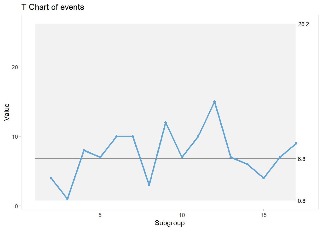
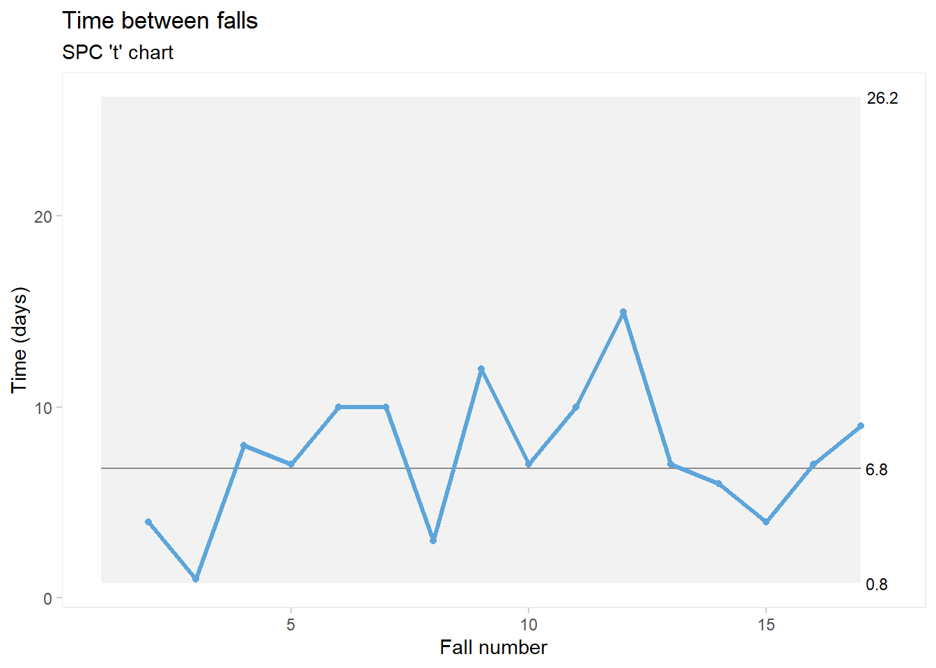
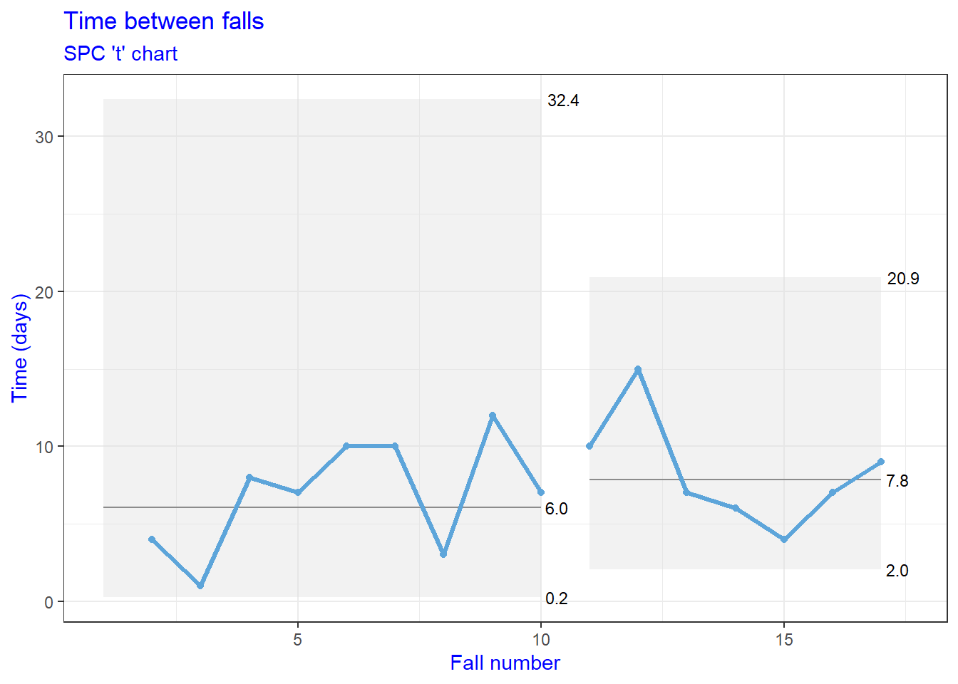
We might as well use the example data provided on that rather nice NHS PDF document. It looks to be measuring time between falls.
Code
# Create an object with the dates of the fallsfallsDates <-as.Date(c("2014-03-02", "2014-03-06", "2014-03-07", "2014-03-15", "2014-03-22","2014-04-01", "2014-04-11", "2014-04-14", "2014-04-26", "2014-05-03", "2014-05-13", "2014-05-28","2014-06-04", "2014-06-10", "2014-06-14", "2014-06-21", "2014-06-30" ))# Calculate the time between eventsevents <-c(NA, diff(fallsDates))
The NHS PDF has one feature I don’t like, it uses dates along the x-axis. I don’t think that’s great practice, as dates on an x-axis should usually be on a time scale and these are actually the specific dates of events. There may be times that’s useful - such as picking out events around holiday periods etc. But usually the x-axis for a t-plot should be a sequential line of event numbers.
In its simplest form qiplots2 will give as a t-chart with just this code:
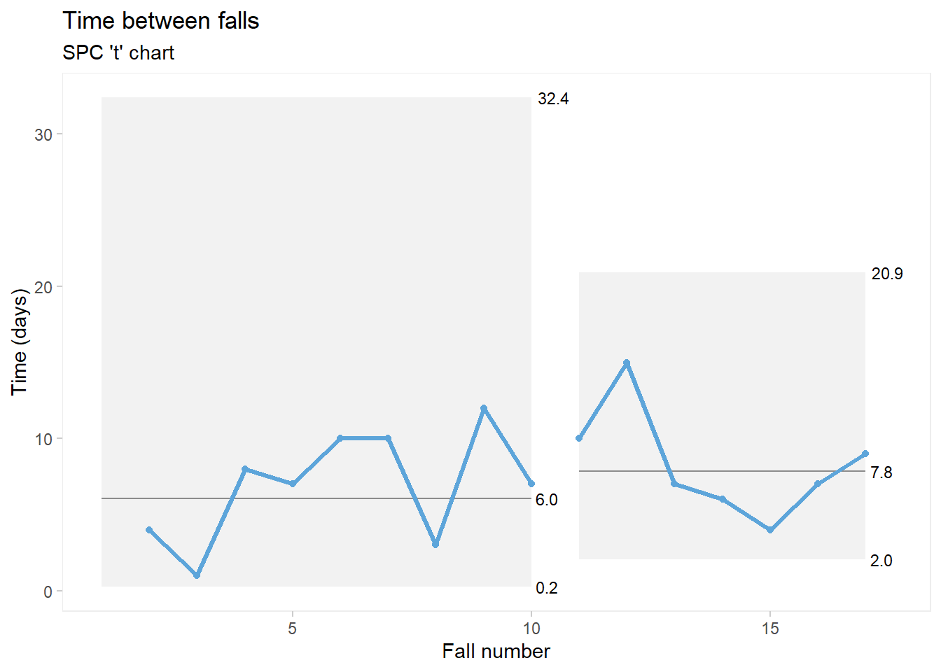
And you can either freeze data or split the data at a certain point if you want to see if an intervention is helping. For the sake of demonstration we will assume some falls reduction intervention was introduced after the 10th fall.
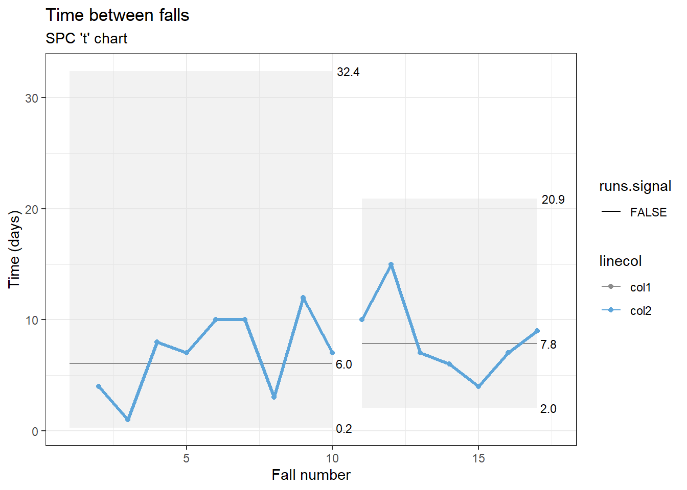
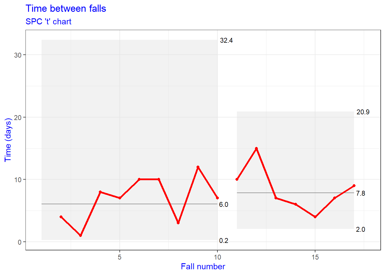
Adding the theme, means if the theme has a legend it will appear, but we can turn that off as usual with a ggplot theme legend position none statement. All this means we can edit the plotting canvas, the size of text, the fonts, etc. But the actual data lines and the grey shaded 3 sigma zones (produced with a geom_ribbon are beyond easy reach).
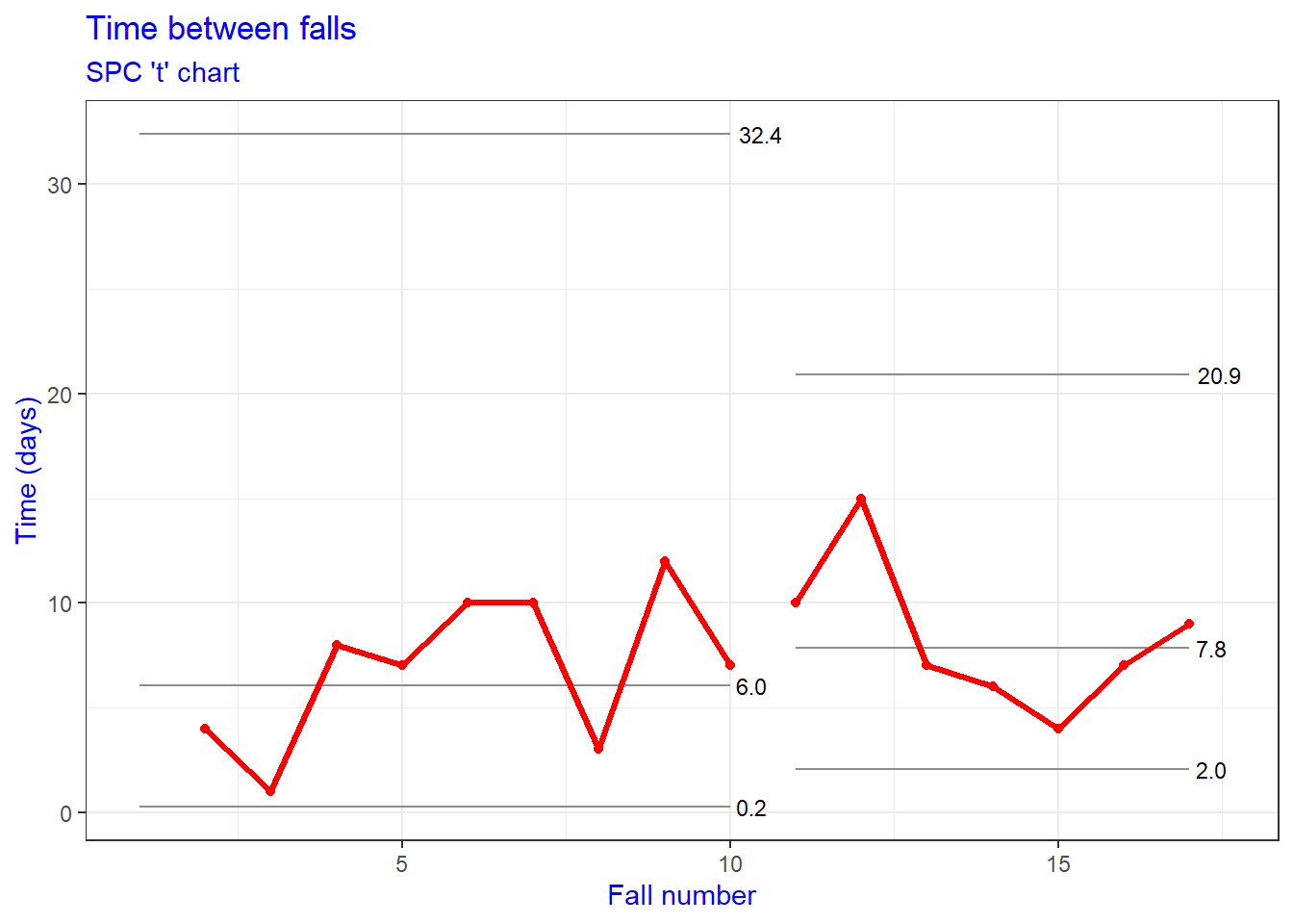
I couldn’t see an easy way to change the lines and shading. It might be possible by hacking a grob produced from the plot but frankly that felt like far too much effort. I might as well try and draw the graph from the raw data! This is open source software - which means we can see the code that produces the graph and thats always worth a look in these situations. The key functionfor plotting lies here.
So, actually - the plotting function is looking up its colours from a set of options called qic.[variable] and applying some defaults if these are not set. That means we can set those variables and change the colours.
And there we have it. A chart with line colours edited, text adjusted and the shading removed. Why the package authors didn’t do it with geom_qichart I don’t quite know. But if you need a customisable qichart for a time series, I hope these notes help.
— Content on this website has been produced with reasonable care. However, errors can occur. Opinions change over time. Code that worked at the time of publication may no longer work. Users of all content from this site do so at their own risk.
References
1. Reading, C., Wellesley-Miller, S., Turner, Z., Jemmett, T., Smith, T., Mainey, C., & MacKintosh, J. (2021). NHSRplotthedots: Draw XmR charts for NHSE/i ’making data count’ programme. https://CRAN.R-project.org/package=NHSRplotthedots